

23 Sep 4 Surefire Signs Your Lawyer Website Sucks
Avoid These 4 Common Legal Web Design Mistakes.
As a former attorney and a longtime web developer, I’ve spent many years following web design trends, as well as checking out my competition’s online presence. I’ve seen very well-executed lawyer websites, and I’ve seen some terrible ones.
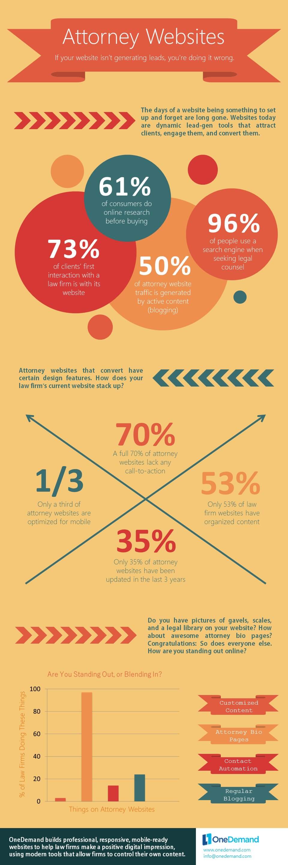
Why does your website matter? Let’s look quickly at some numbers:
So, how can a lawyer – trained in lawyering, not in visual design or UI/UX – know if their law firm website sucks? Here’s 4 surefire signs.
Your Lawyer Website Sucks If It Lacks Responsive Design.
Responsive design is a technique that results in a website re-sizing automatically to fit any size screen – from your desktop, to your iPad, and to all different flavors of mobile phones.
How can you tell if your lawyer website is responsive? Look at it on your mobile device. If you have to scroll or resize the screen horizontally, it is not responsive. If the website looks totally different than the usual desktop version, it is not responsive (and is likely a “mobile only” version, or what we call “m-dot”).
[RELATED: 3 Common Law Firm Internet Marketing Mistakes]
Not only does responsive design make for a more consistent and better user experience, it also is a factor in how Google shuffles its rankings. Lawyer websites that are not mobile-friendly are penalized in the rankings, and keeping a separate “m-dot” website is kryptonite for your law firm’s SEO.
Your Lawyer Website Sucks If I Can’t (Easily) Find How To Contact You.
I’ll admit this one baffles me. The entire point of a law firm having a website ought to be impressing, attracting, and then converting prospective clients. And, that’s it.
Yet, I constantly see lawyer websites that lack any easy way to contact the law firm. Perhaps I can find contact information in small print in the footer, or I’ll find it only on the contact page.
Make it easier – not harder – for potential customers to contact you, counselor!
[RELATED: 5 Attorney Web Design Tools In Our (Non WordPress) Toolbox]
Numerous UI/UX studies can tell you where the human eye will go on a website. Make sure your contact information is readily available there. Make sure you are using forms. Use calls to action.
And, you can go even further with pop-ups and chat functionality, but I caution lawyers to avoid using these techniques without consulting with a professional web designer. Done right, they can help increase conversions. Done wrong, you’ll annoy the heck out of your prospective clients.
Your Lawyer Website Sucks If It Reads Like Your Resume.
I get it. I’m a lawyer, and I went to law school, too – and a good one at that. We’re all proud of our achievements and professional accomplishments, and want to use them to differentiate ourselves in a competitive, crowded legal industry.
But, here’s the thing: Prospective clients care the most about their legal problem. They’ll care about your qualifications, too, but only after they feel you can help them.
Don’t have your lawyer website read like a resume! Save that for your interior attorney profile pages, if at all. Instead, make sure you are using your website’s real estate to directly address why a legal consumer would have landed on your website in the first place.
Again, your lawyer website exists to pull in client leads, period. Keep your focus on that. Vanity shouldn’t be a factor.
Your Lawyer Website Sucks If You Need A Law Degree To Understand It.
This one can be tricky. We are talking about lawyer websites, after all.
The offense I’m flagging here is when the website’s copy – not necessarily its articles – reads like a legal brief. While that makes sense to lawyers, keep in mind who your audience is: prospective clients who presumably didn’t go to law school.
Many times lawyers get married to language they want included on their website, or they’ll come up with complex compound sentences to satisfy everyone on the firm’s website committee. It’s important for the lawyer to be aware that their perspective as attorney might be blinding them to the website’s ultimate objective – generating leads.
[RELATED: Attorney SEO Update: No More Redirect Penalties]
Legal consumers are no different than any other consumer doing online research. They need content and copy that is easily digestible, and avoids long paragraphs and sentence structures that will lull them to sleep.
While using legalese might seem like a good way to convey the gravitas, seriousness, and knowledge of your law firm, the net impact is almost always the opposite. It runs a risk of seeming obtuse, confusing, and intimidating to your users.
—
You’ll notice I didn’t include the more traditional complaints about lawyer websites above – things like using homepage sliders, standard lawyer headshots, or stock imagery of scales, books, and the like.
And, that isn’t because I don’t think those things suck. It’s more that I think they can suck less if done right. As a practical matter, I’ve found plenty of law firms will insist on them anyways, so our goal as an Orange County attorney website designer has to be making them suck less.
At OneDemand, we’re doing our part to end terrible lawyer websites by offering all-inclusive web design plans starting at just $199/mo, which feature a design refresh every 24 months.
What else do you think makes a law firm website suck? Let’s hear from you in the comments, or on our social media.
Best,
Scott J. Jackson, Esq.
Sorry, the comment form is closed at this time.